Our visual identity ensures that UIC’s diverse internal and external audiences can immediately recognise our organisation in all our forms of communication.
It is based on compliance with graphic and editorial standards which ensure the consistency of all our communication aids.
It therefore plays an essential role which depends on good practice being applied by all.
The graphic charter is presented over the following pages.
Templates for the main documents and communication aids (PowerPoint presentations, headed paper, agendas, meeting minutes, statutory documents, etc.) are available in your Office suite. The UIC logotype itself is available on the Communication intranet pages.
Finally, the Communication team is available for any questions or support related to this topic.
#1 Why provide information on visual identity, and why now?
Visual identity gains credibility. UIC demonstrates its professionalism by working with a graphic charter.
A visual identity is estimated to last around ten years and the most recent developments of the UIC logotype took place ten years ago. Thus in 2020, we believe it is necessary to refocus our visual identity onto a single logotype, which will be simpler to use and will assert a powerful image of UIC.
#2 What is a visual identity – and a graphic charter?
A visual identity symbolises an organisation. It expresses an original personality and a unique character. For UIC, it consists of all the visual elements that represent our identity across all the different communication aids. The primary elements consist of a logotype, a typeface and colours.
The graphic charter, or set of standards, which makes up these visual identity guidelines provides all the instructions for its use.
A visual identity cannot be modified.
#3 What is the purpose of our visual identity?
Our visual identity allows us to express:
Having a visual identity based on a graphic charter guarantees consistent use on all UIC’s different communication channels. An image must be consistent, regardless of whether it is used on a brochure, a business card or a PowerPoint presentation.
#4 Everyone must promote our visual identity.
Every single person must be committed to these guidelines. We are relying on each of you to promote a unified image of UIC in all your communication forms.
The Communication team is at your service and ready to answer any questions you may have.
The logotype symbolises UIC. Thanks to its reach, it plays a key role.
The main logotype is composed of:


The blue-green graduated colour of the main logotype is largely responsible for the visual recognition of UIC. Consequently, it needs to be accurately reproduced.
Grey is used for the baseline on the main logotype, and for the grey single-colour version of the logotype (see “Single-colour logotypes”).
| Four-colour process | C 100 - M 15 - J 0 - N 0 | C 65 - M 0 - J 65 - N 0 | C 20 - M 0 - J 5 - N 55 |
| RVB (screen) | R 0 - G 155 - B 223 | R 87 - G 189 - B 132 | R 109 - G 129 - B 134 |
| Spot colour on coated paper | PANTONE DS 225-2 C | PANTONE DS 274-5 C | PANTONE DS 327-5 C |
| Hexadecimal | #009bdf | #57bd84 | #6d8186 |
| RAL | 5015 | 6024 | 7046 |

The main logotype with baseline should be used most frequently.
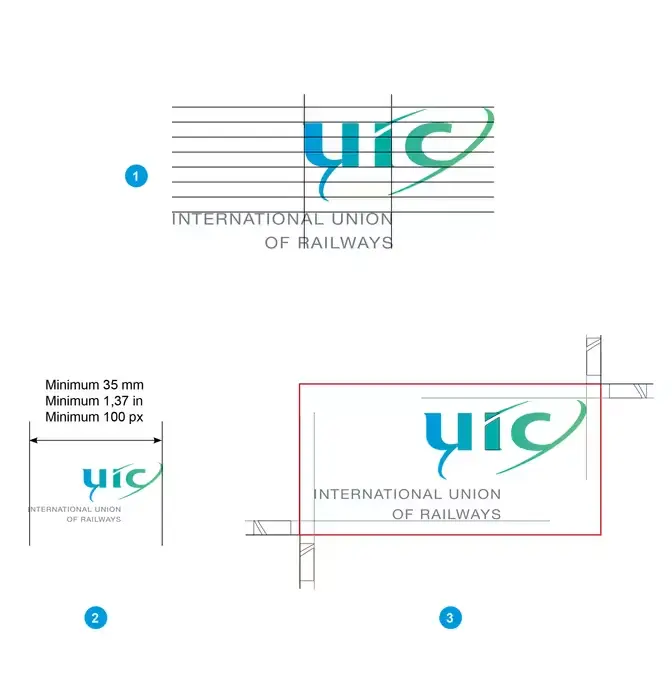
This main logotype without the baseline is used on:
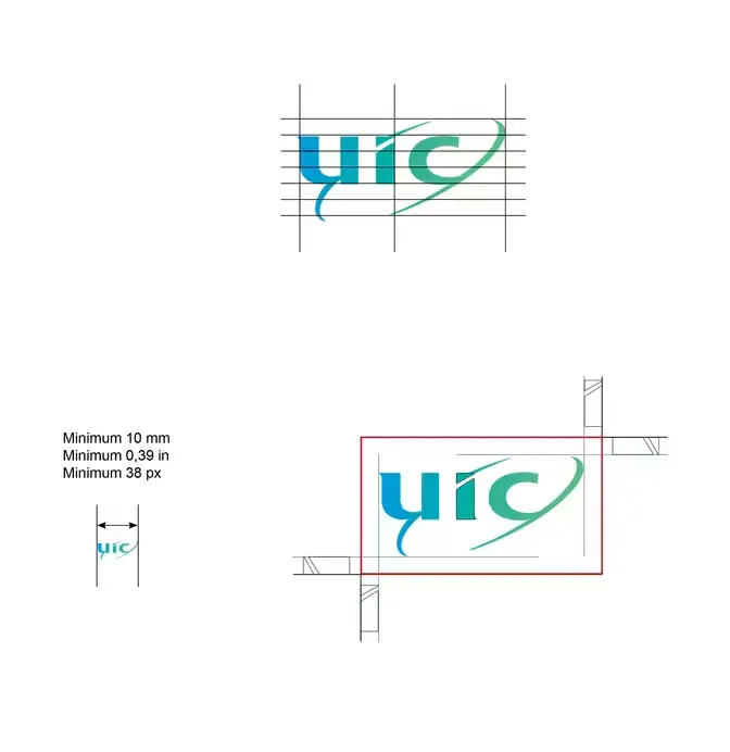
It must comply with a minimum size and a blank protection area.
Depending on the requirements and the aids, three single-colour versions are available:-*
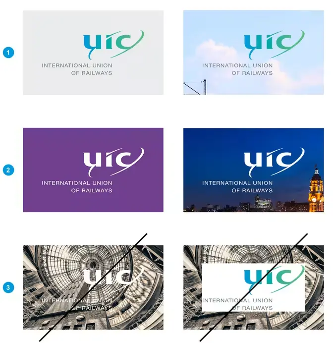
In general, prioritise the use of white backgrounds for the use of the main logotype. If this is not possible, follow the rules below:
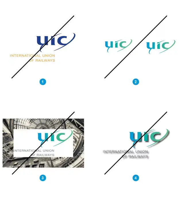
The modification of the files provided is not permitted. In particular, we ask that you:
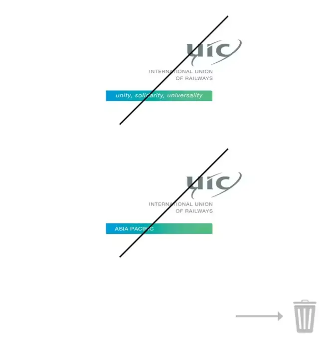
From March 2020, the use of former versions of the UIC logotype is not permitted.
This concerns:
Our colour palette consists of three categories:
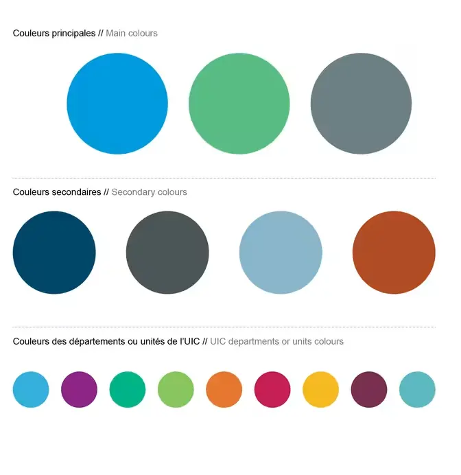
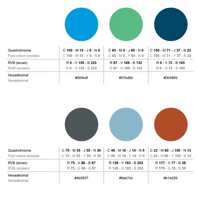
Secondary colours are the versions that can be used in PowerPoint presentations and Word templates. They are part of the UIC Microsoft Office theme.
This table presents the colours allocated to each UIC department or technical unit.
These colours aim to make it easier to identify online and paper publications associated with these departments or units.
Support functions (Finance, Human Resources, Communication, IT, etc.) and institutional relations will use the UIC colours for any required publications.

This table presents the colours allocated to each UIC region.
These colours aim to make it easier to identify online and paper publications associated with these regions.
They are used on the covers of regional publications (Visions, etc.) and for sidebars in general documents (Activity report, Work programme, etc).

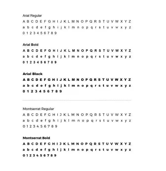
The UIC font is Arial, 10 pt (11 pt also accepted).
Arial is a sans serif font and has been chosen because of its readability, web accessibility and simplicity. It is available on PC and MAC and its many variations are sufficient to organise information by priority (bold, bold italic, italic, regular, black).
The font Montserrat may also be used, but only for headings.
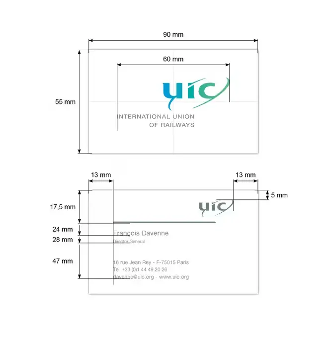
Business cards consist of one side in colour with the main logotype in English in the centre and one side in grey (see “Logotype colours”) with names, titles and contact details:
The form for requesting business cards is provided on the ETF intranet.
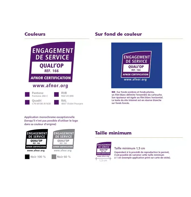
Documents such as external mail, for statutory meetings and the website must include the “Certification Engagement de Services” logotype.
This logotype is accompanied by the following phrase:
These guidelines are provided for information purposes only. The relevant document templates already contain this logotype. Any use of the logotype outside these templates must be approved by the Communication and Quality services.
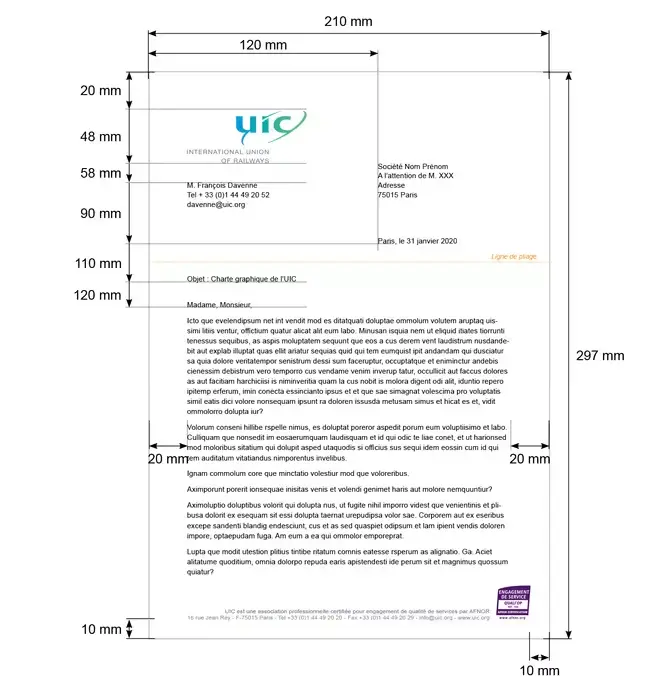
Letters are written in Arial, Regular, 11 pt, on 15 pt leading, in black.
Several Word letter templates (meeting minutes, invitations, etc.) are available in FR and EN in your Office suite, or on the Communication intranet pages.
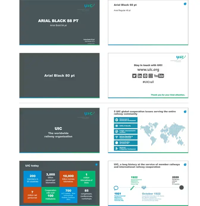
All presentations must be made using the provided template.
PowerPoint presentations must be in the 16:9 format. For the rare instances where this format is not appropriate, a version in 4:3 is also available.
The template is available in FR and EN.
The UIC PowerPoint presentation template is available in your Office suite, or on the Communication intranet pages.
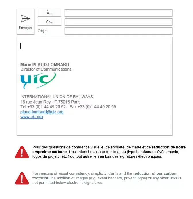
Use the font Arial, 10 pt, in black, for email text.
The signature is in Arial, 9 pt, grey (R 102, G 102, B 102), text aligned to the left.
It is formed as follows:
NB: modifying colours is not permitted.
Remember: The lighter your email message, the lighter its carbon impact. A lighter email message maximises its deliverability (images, heavy messages can be considered as spam).
The grey area is reserved for images and text.
The white area is reserved for the logotype. Nothing else may be placed in this area.
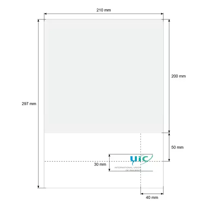
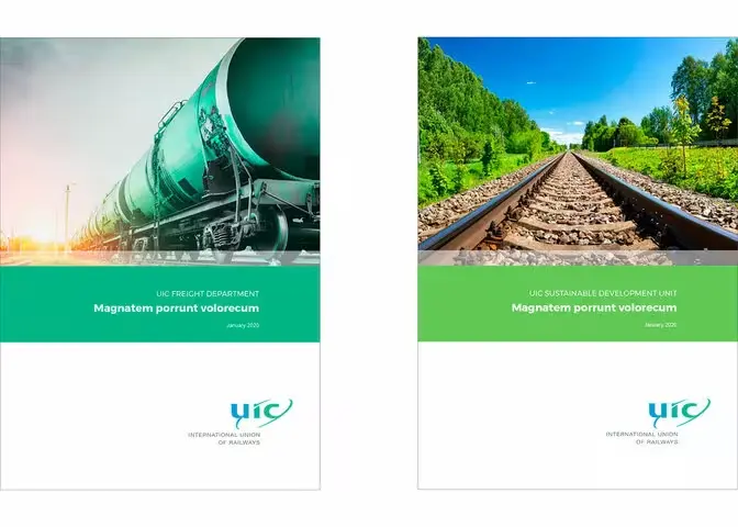
The front cover for department presentation brochures is split into three sections:
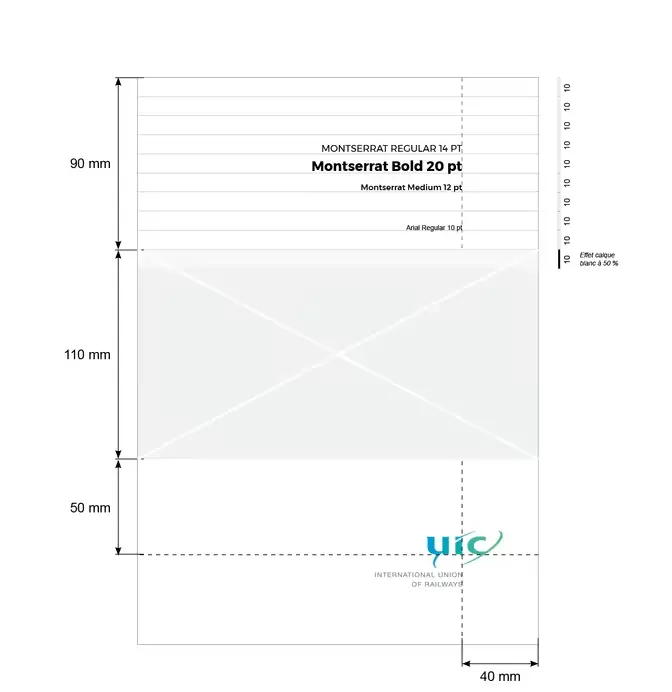
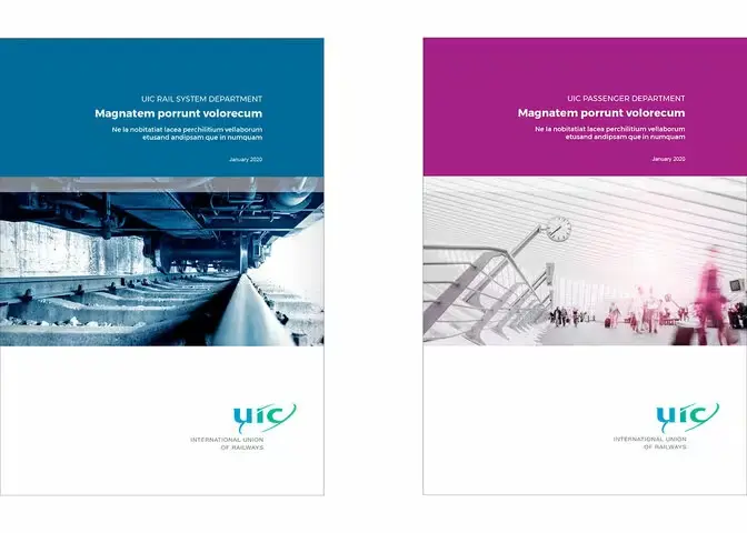
La couverture des brochures techniques des départements ou unités de l’UIC est divisée en 3 parties :
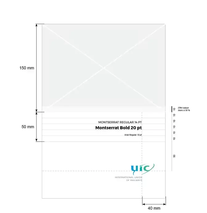
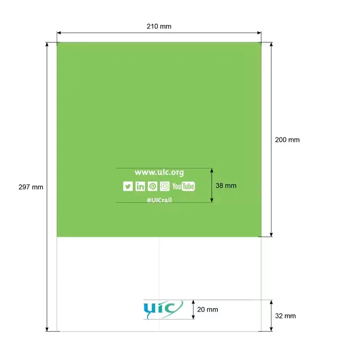
The back cover repeats the colour chosen for the front cover.
The grid of social networks, in the white version, is centred horizontally and vertically.
The compact version of the UIC logotype is used, centred at the bottom of the page.
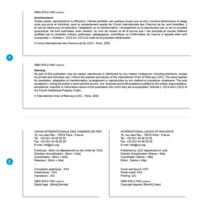
Documents published by UIC must carry the copyright text, an ISBN number (provided by ETF) and legal information.
Font used: Arial, Regular, 7 pt.
NB: all documents published by UIC are subject to legal deposit and must be sent to the Bibliothèque Nationale de France (contact ETF).
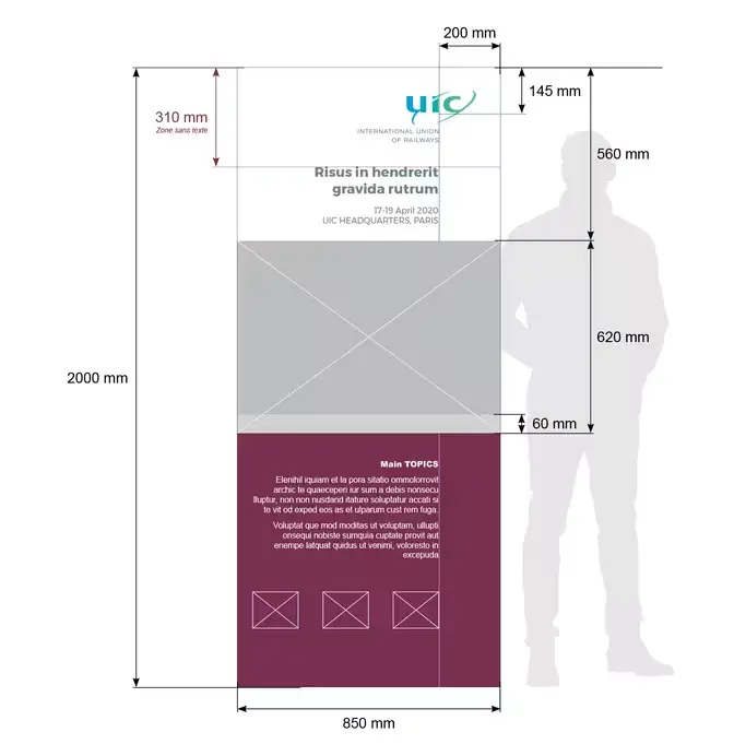
The format for kakemonos is 2000 x 850 mm.
The template is split into three sections: